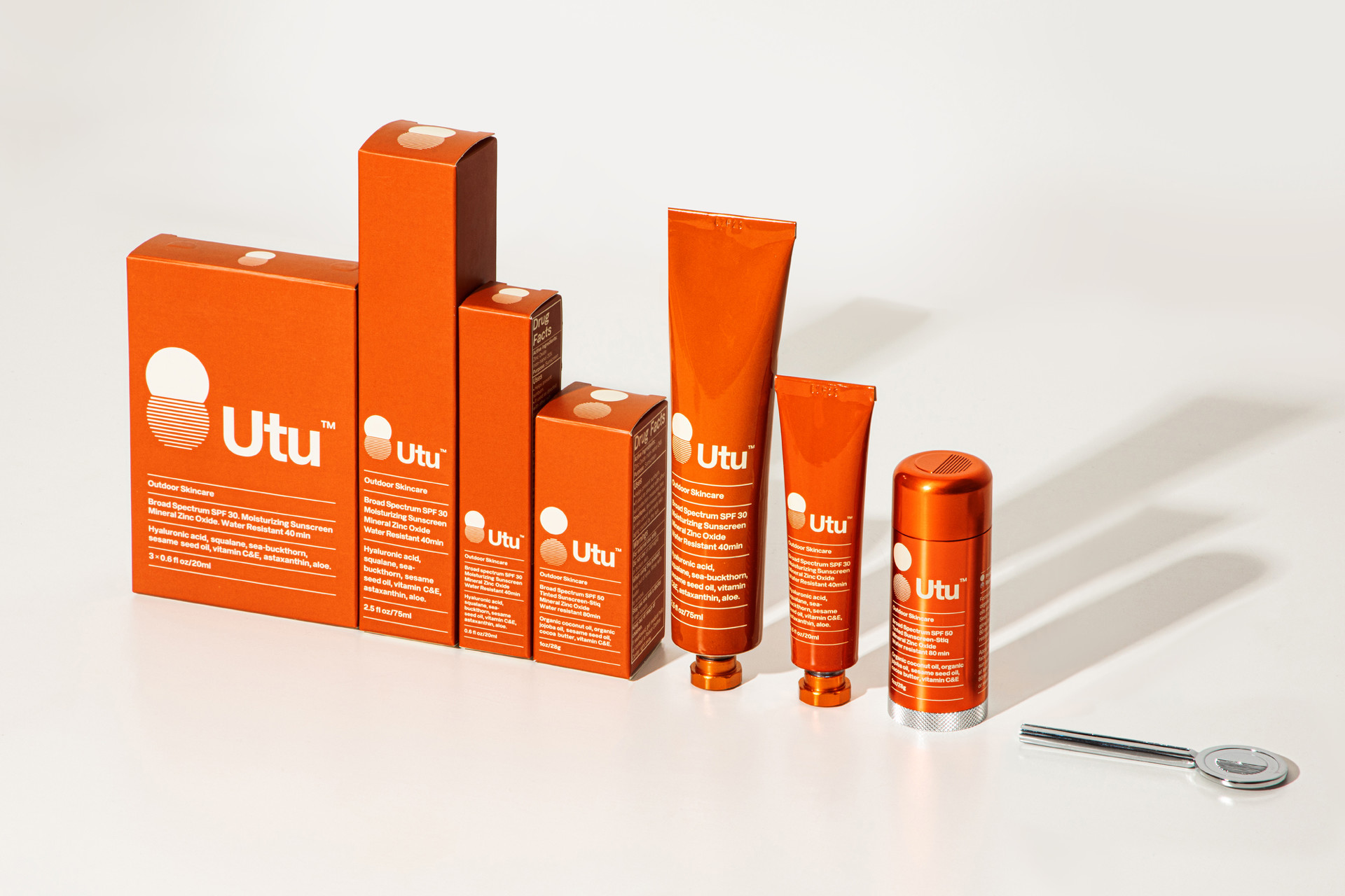
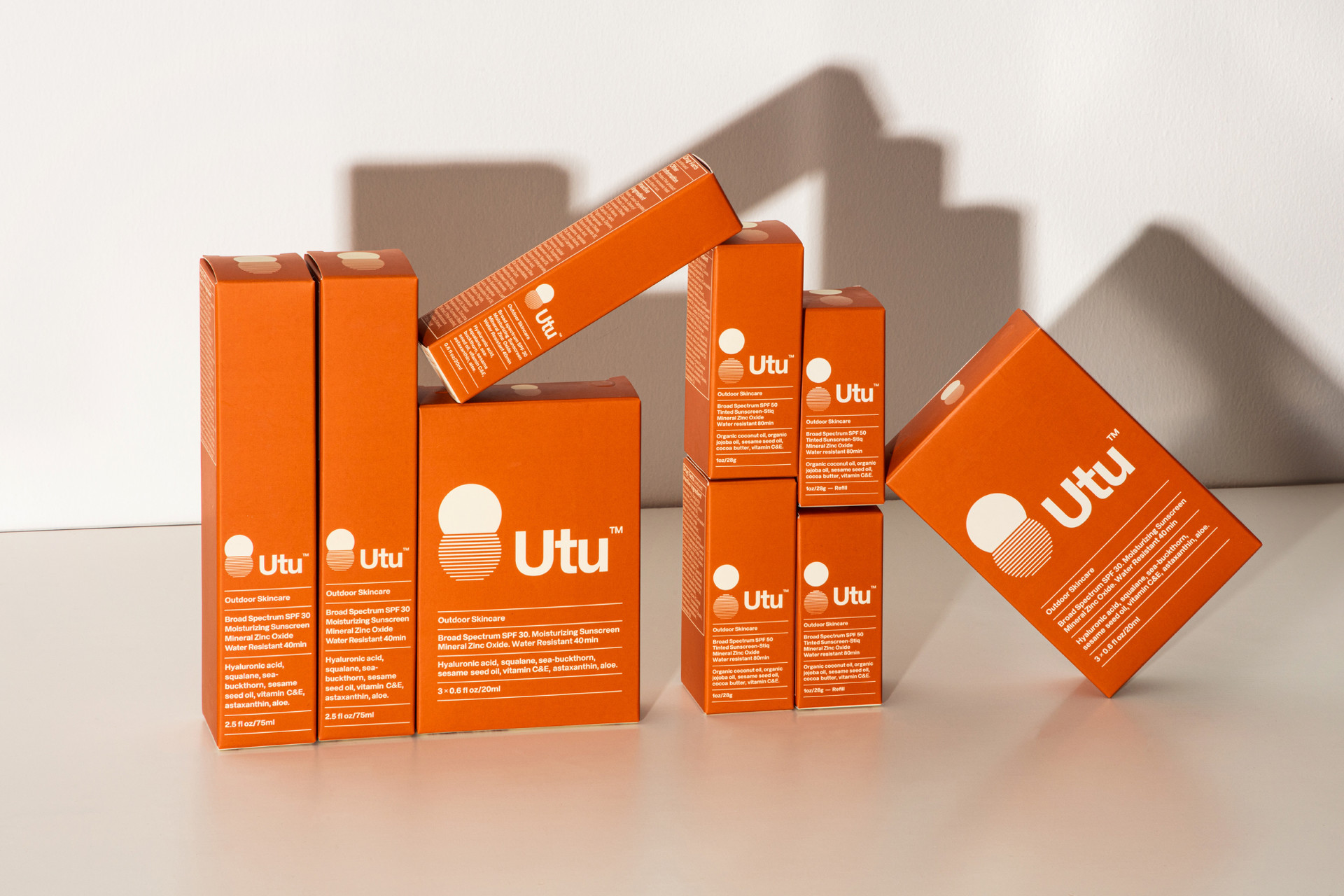
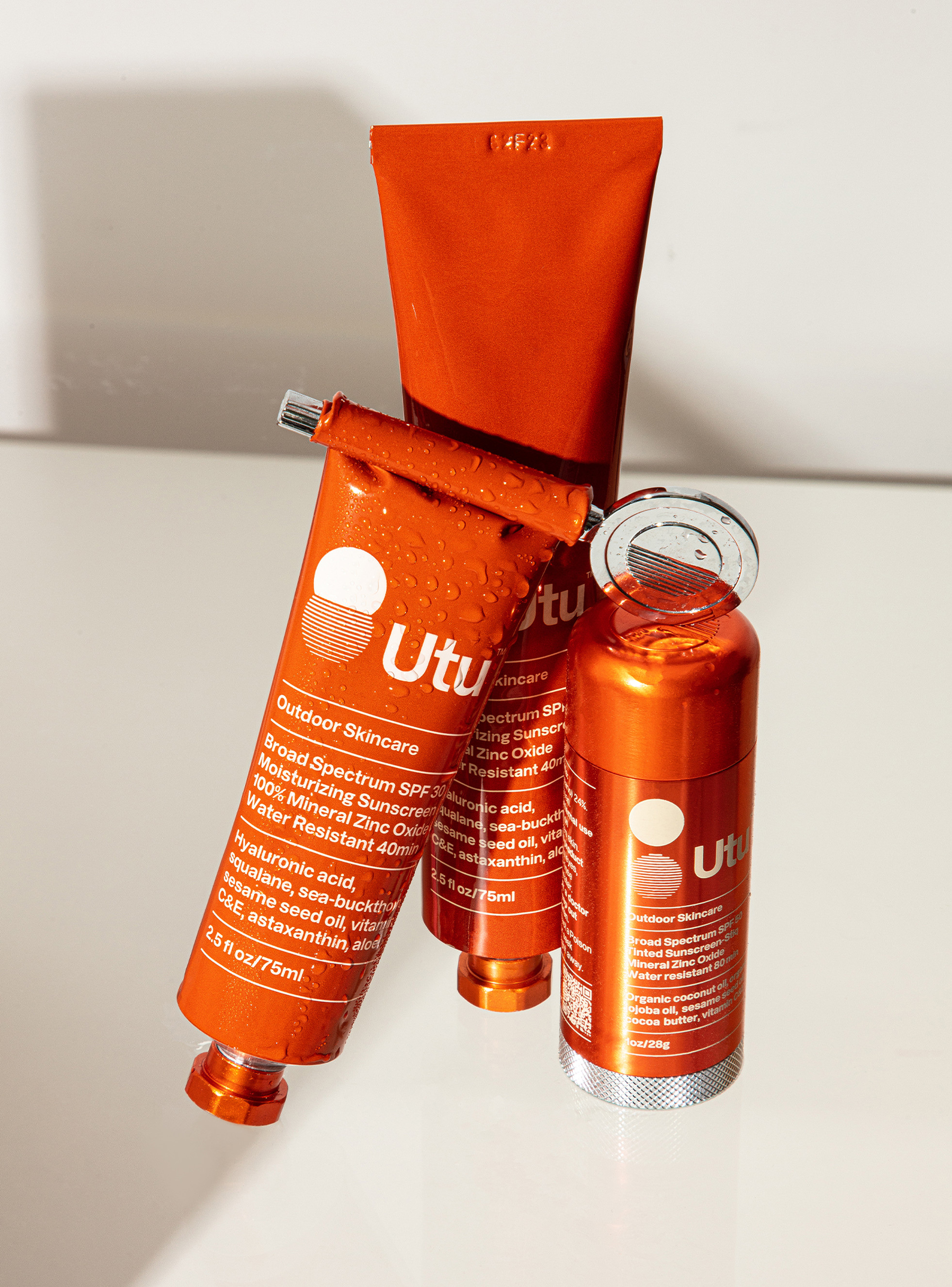
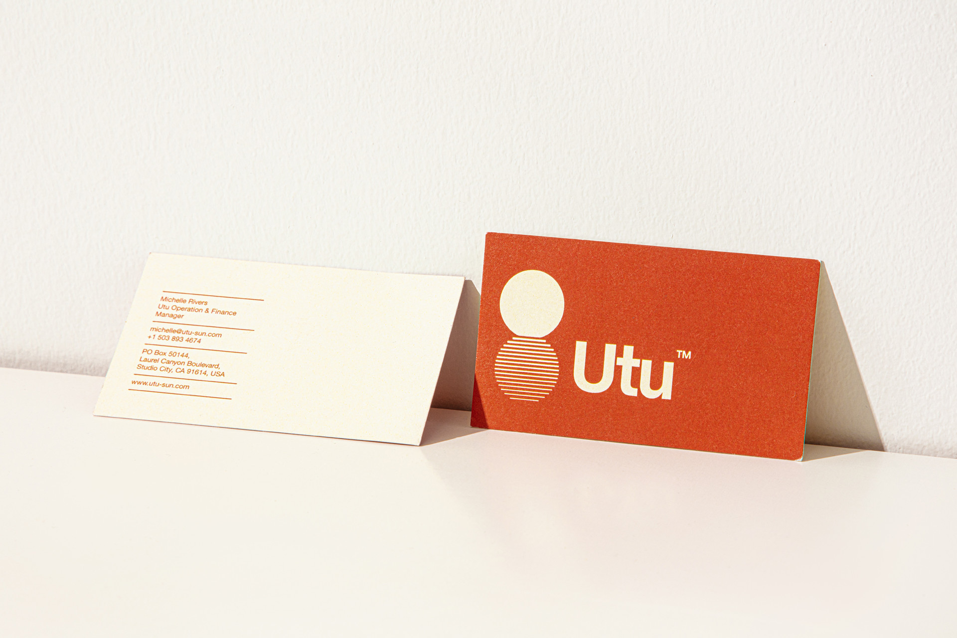
When asked to help launch a new outdoor skincare brand named after the Sumerian sun deity, Utu, we decided to create a modular and evolutive identity. Our rising sun icon varies depending on the level of SPF : the further from the horizon the stronger the protection.
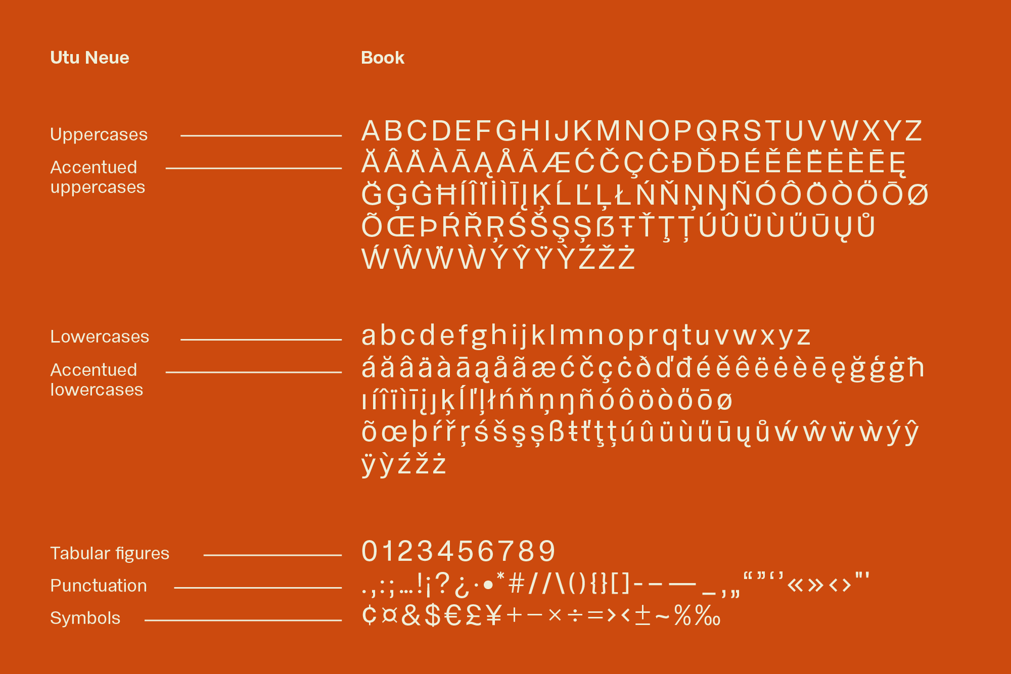
UTU’s first line of products showcases the brand’s iconic visual identity system in a coherent and systemic manner. The evolutive rising sun logo has variants where the sun is distant from the horizon (for maximum SPF), and variants where the sun is half below the horizon line (for minimal SPF). Each tube, stick, box and roll-up key has its own version of the logo, for an instinctive understanding of the level of SPF. The brands’ orange and beige tints are used and matched throughout, on all the (plastic-free) products. The packaging and logo are composed with Utu’s custom typeface, and follow a strict hierarchy system, also in use on the website, social media and newsletters. Radically different from sun-care brands existing on the market, Utu is as uncompromising in its product composition and its packaging construction, as it is in its visual identity.
Photo credits : outdoor ©Utu outdoor skincare, still life ph. Emmanuelle Lubaki ©Yorgo&Co.